User centered design process - a before and after sample.


Results: New Grid, Flyout functionality adds width, and multiple device adaptability, reduced navigational strain,


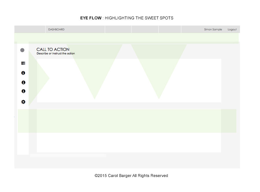
Rule of thirds Zone of “fovea centralis” Ocular sweet spots Pattern fixation zones Intuitive decision point location White space to content ratio 50:50 1. Immediate task recognition 2. Secondary / task trigger 3. Supporting, or decision point


The Researcher

Client:
Manzama LLC
Bend, OR
The project:
Evaluate and design responsive UI framework, data visualization, usable and beneficial concepts for interaction when querying, researching and customizing large-scale published media streams, managing subscription-based information feeds, displaying data analytics, as well as enhancing product brand recognition.
Main challenges:
-Sense of Location - 56% greater return on their application investments if designers simply make the searchable items easier to locate.
-Enabling users to focus on one activity or task at a time. Potentially less distraction and overwhelmed by other screen elements competing for their attention. For this to be a benefit, we obviously have to modularize the application in ways that make sense to users and minimize the need or distraction to refer to information contained in other areas.
-More goal driven - Allow self-learning a core set of features fairly easily during their early days of system use.
-Avoid a high learning curve - allow for users to explore the user interface and learn it's features.
-Simplify navigation - some navigation implementations risk pushing users into a state of cognitive strain which lessens the likelihood of them taking desirable actions.
Solutions:
-Tighter proximity for areas of information
-Flip the main tool bar on the right rail (home page / persistent)
-Optimize for ocular fixation areas
-Expand on home page concept, to give wider breadth to news
-Flip trending to higher visibility
-Display snippets
-Other filters….monitoring on daily basis, more comfortable level, adjacent to other load. – quick filters, popular, or selective, or type in a keyword. Runs filtered view, plus other story activity
-Move to adaptive / responsive design direction
-Minimalist approach – single button navigation OR flyout navigation provides additional discoverability.
-Begin connecting, mocking up structure – vertical smart phone, 724 tablet portrait
-New branding, color palette